This is all the work I have done in Digital Media 1 on Photoshop.
|
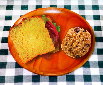
Sandwich Activity
Adobe Photoshop Each different layers made up parts of a sandwich. I had to understand and put together a sandwich using layers, digitally. I also had to add something else to the plate, so I added an oatmeal cookie. I think that it's outline is perfectly cleaned and the picture really makes me think that this is a real photograph of a sandwich and a cookie. However, the saturation of the bread from the sandwich kinda gives it away from making it believable; it's saturation hurts my eyes and it doesn't look appealing to eat. |

|
Beetle Ad Project Adobe Photoshop I think the color of the car helps turn my eyes directly towards the car as the focas point of the commercial. It's color isn't too out of place and I'm proud I chose red for a beach environment, But, when you read the text above, the sunlight hurts my eyes. I could've definitely toned down the brightness from the sunlight. |
|
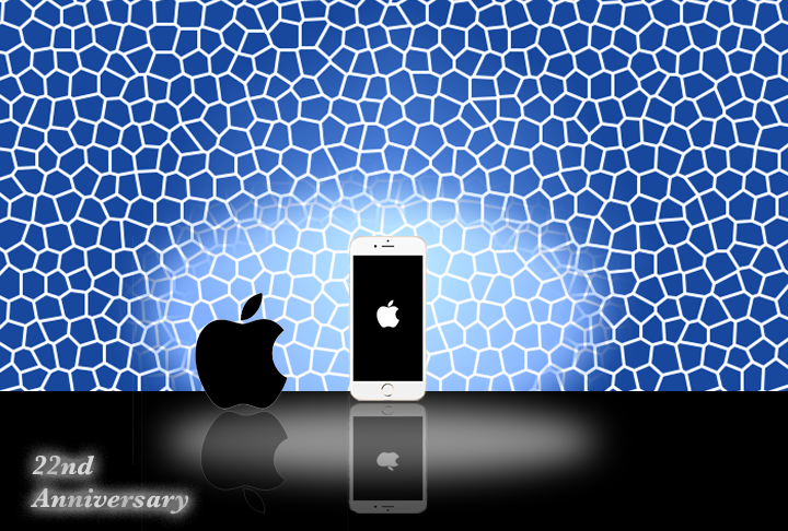
Reflections Project Adobe Photoshop The spotlights shown on the phone shows a great emphasis on directing your eyes to the phone, along with the logo. The logo helps the viewer understand what kind of phone it is as well. However, the outline of the apple logo next to the phone is shown, which isn't very appealing. I should've took more time to get rid of it. |
|
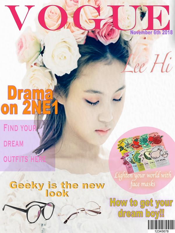
Magazine Cover Project Adobe Photoshop I love the picture that I chose for this magazine cover. I wanted to find a picture that showed feminine beauty with an innocent yet charming aesthetic to it. This picture exactly meets those traits. Although, I am disappointed on how I arranged my texts. The bottom of the magazine cover looks messy and I wasn't sure how to organize it. I think I should've placed the glasses right of the page, in order to fill up the white space. |
Photoediting
|
|
Girl: Adobe Photoshop In this activity, I have to cover up the acne on her cheek. I used spot healing brush tool, along with some other tools to brighten up her cheeks, brighten up her eyes, etc. I think I did a good job covering up the acne. The only complaint I have is that I oversaturated the corner of her nose. It honestly looks like she's been scratching it- which isn't what I intended. |
|
|
The Archway: Adobe Photoshop The original picture looked icky and gross because of the saturated green and yellow colors. After editing, I took those colors away, and added some saturation of blue, and brightened up the new picture. I'm very proud of the choice since it helped out with the appeal. Right now, I don't see anything that I can improve on. I think it looks fine the way that it is. |
|
|
The Lighthouse: Adobe Photoshop My objective was to use selection tools to create a binocular point of view at the lighthouses. A part of me likes the transparent purple binoculars since it creates a nice and relaxing mood in the piece, but another part of me wishes that it wasn't as transparent because it's hard to tell that it's suppose to be binoculars. |
|
|
Watercolor Golden Gate Bridge:
Adobe Photoshop I absolutely love filters, so I was happy that I got the chance with working on it in Photoshop. I love the results of the watercolor effect in the background; I think it looks absolutely gorgeous and it makes me feel at ease. I don't really know how I could improve this piece. I'm pretty proud and impressed of the result. |
